Alan webstore analytics
2021
Alan is a tool that decodes the vast amount of data generated from your webshop and applying it to optimize your entire value chain. Alan it also soon to be the new name for a coalition of web analysis companies that needs a new visual identity to tie them together.
Project assets:

Contributors:
Yann Bougaran
Jimmy Winsjansen
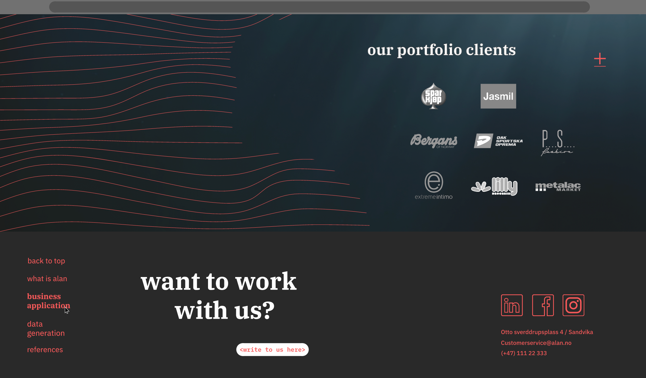
Customers:
Alan
Exhibition below

Alan works in retail
Alan was a soon to be a coalition between two IT companies that dealt with the field of statistics around e-commerce, and how to gage and use data from webstores to increase profits. Their new company just received the visual foundation from Daytwo already and I had to further develop it from there.
001 - Assignment
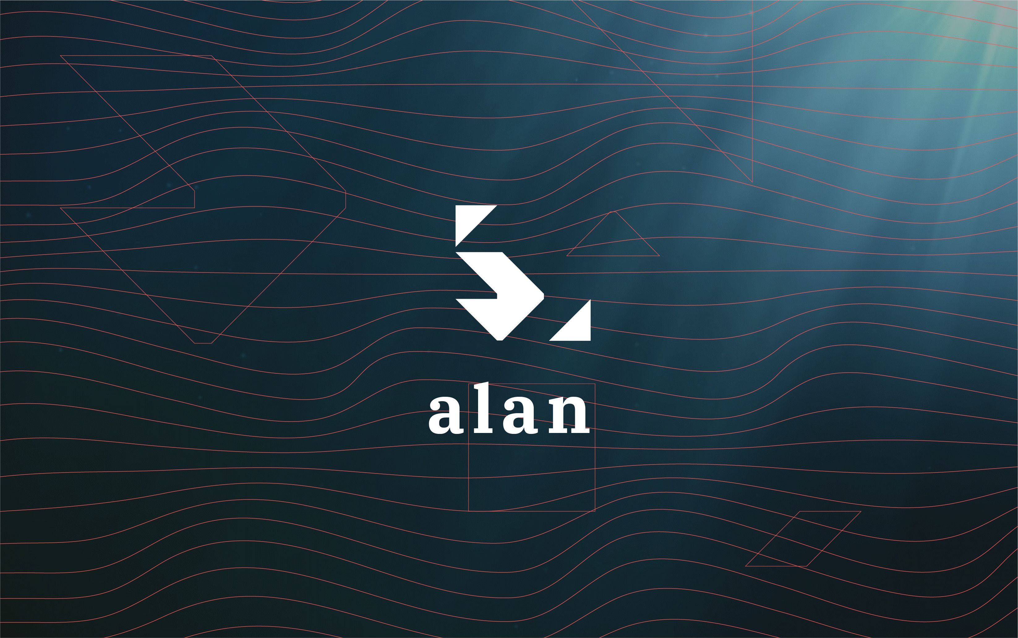
I worked with this project through the communication agency Daytwo where I at the time had an internship as graphic designer. Together with the design team I got to further develop the visual profile for Alan. When I joined the visual identity had already been roughly established, so my job was to further develop the profile into a variety of visual items and format. The first thing I was tasked with was to expand the concept by some sort of layout rules to further build upon. As for now the profile only consisted of a set of logos for each company department, a colour palette including a distinct colour for each department and chosen typefaces. The logos already had a distinct language with their heavily geometrical shapes, so I wanted to experiment and see if I could derive some sort of grid from them. Lo and behold the shapes proved to be constructed from a square grid with a 1:8 ratio on the increment, exempt for the diagonal lines which were drawn directly from corner to corner. I effectively rediscovered a grid that was already there from the beginning, I recreated it in sheets and experimented on how I could apply it on the layout. The first thing I applied it onto were the logos themselves again, since even if the shapes were derived from the grid the layout wasn’t. I layered the grid over them and composed the placement of the shapes to where they naturally would’ve been, and I then tweaked the visual weight, so they looked balanced as well as having a motion in the composition. I then presented my discovery to the team, and they applied the new logos into the visual profile.
002 - Infographics
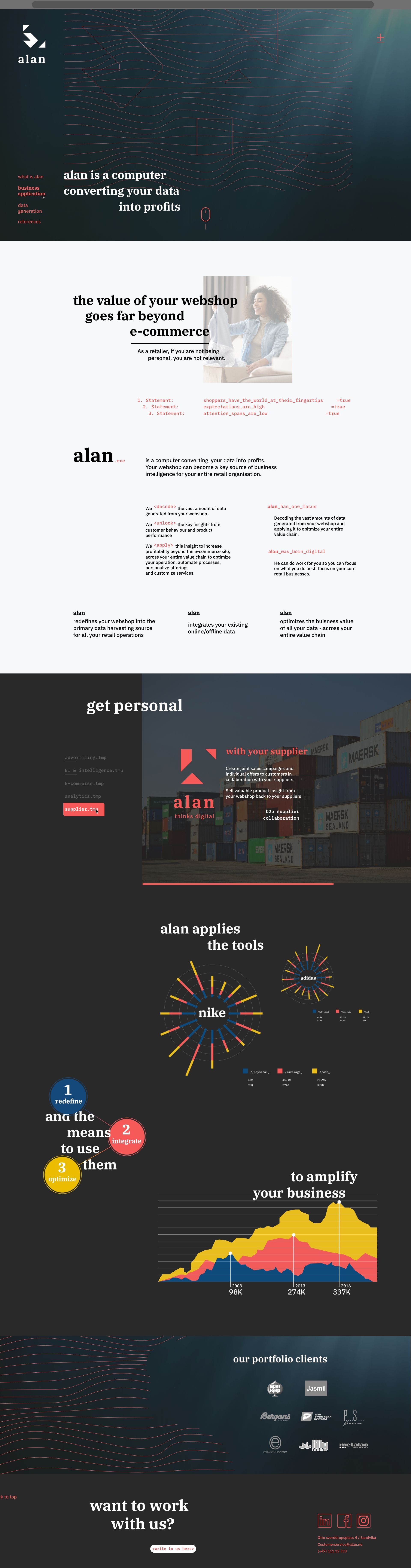
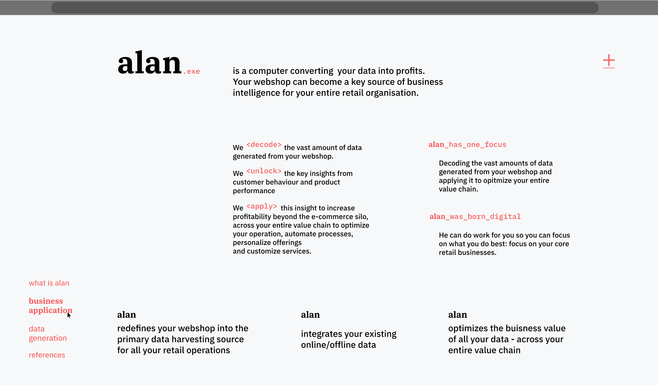
After the adjustment the team was tasked with applying the identity. We divided tasks between ourselves, my colleague was going to update the company’s old pitch-deck and I was going to illustrate examples on how we could use the design on infographics. The company supplied me with typical outputs of data from their analysis software, which were an overwhelming number of infographics and maps cramped together with little intuitive communication on what each increment meant in the grand scale. The client wanted me to remake this in the same manner, only in the new identity since he was going to make a point of this as “we’re generating an overwhelming amount of data” in the pitch deck. The client and the CEO of Daytwo had some discussion about this, in that would it be better to precent data in a more understandable and bitesize sense. The conclusion was that I was going to create both, one of the whole dashboards and a selected few I would pick out. I did so and included them into the pitch deck.
003 - Prototype
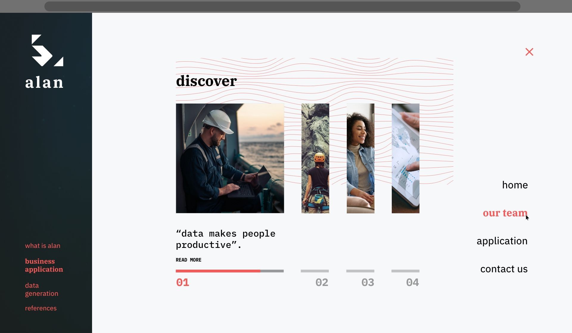
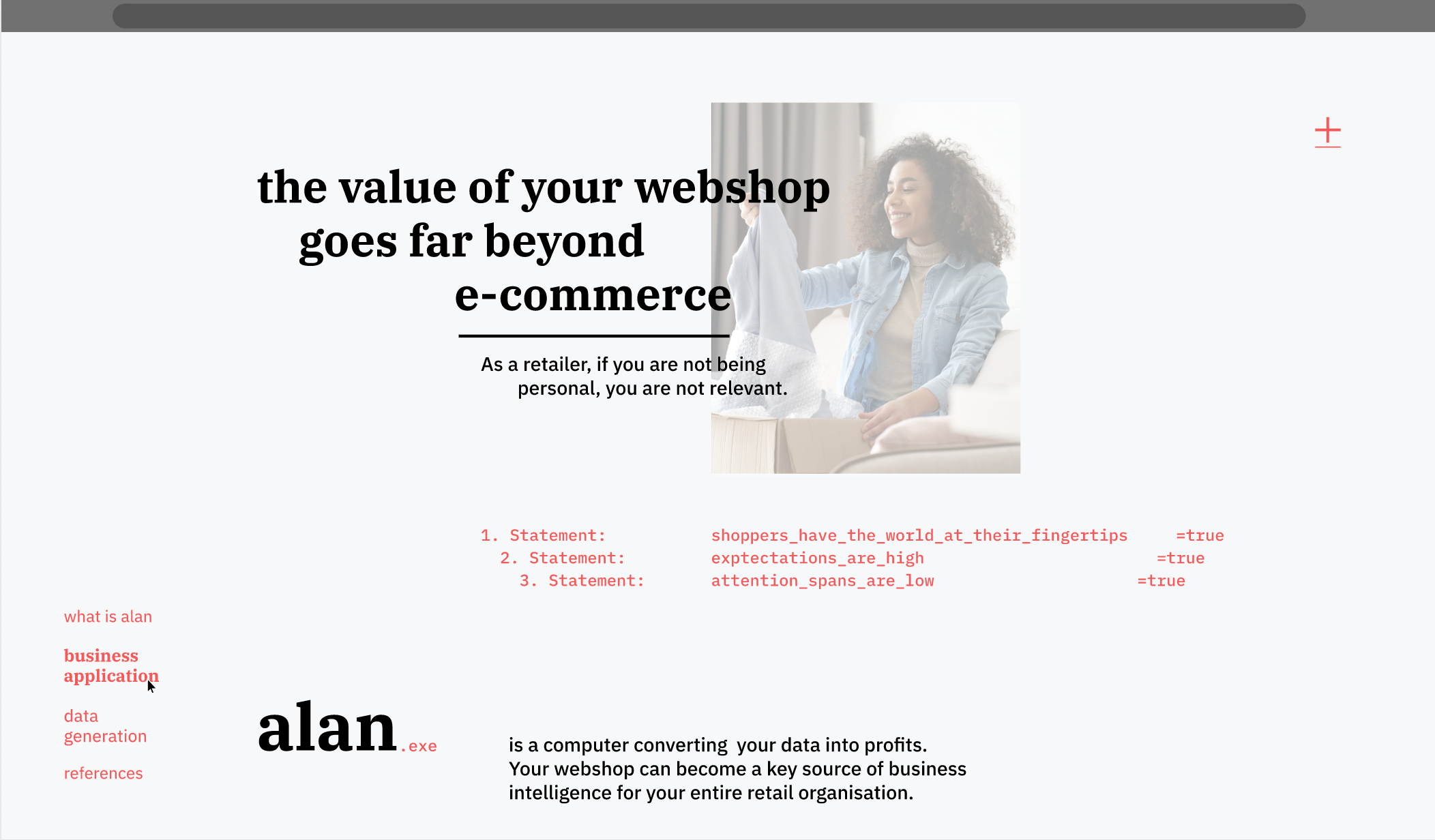
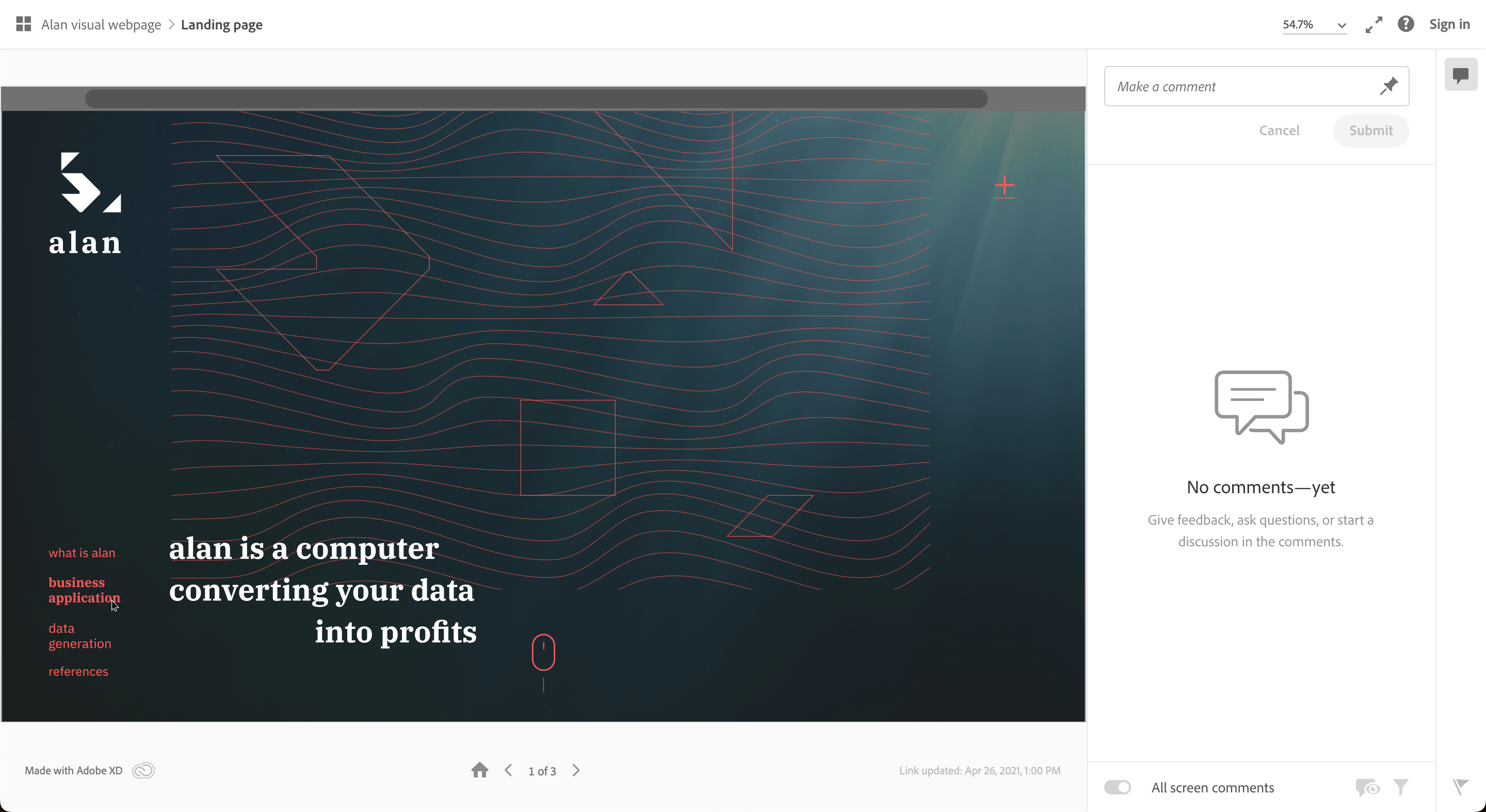
Lastly, I was tasked with designing a proposal for a web-application for Alan. The idea was to explore how the application could look like and the presentation would serve the purpose to kickstart a more in-depth project. I started with some rough sketching in Adobe illustrator and then transferred the ideas into adobe Xd to make it into a prototype. Now the conceptual identity Alan was going for was that Alan is a computer that decodes data. That is, Alan is supposed to be a computer that communicates like a person, sort of like a sentient Ai to bridge the gap between users and the tool. Apple’s Siri is a good example of this, and that is what Alan needed to communicate visually. I used different methods to do so, the main concept being that in comparison to Siri as an application that wants to have this gap be seamless, I wanted Alan to be more transparent since Alan is a tool generate huge masses of marked data. Sort of a rougher Siri with faster, clearer, straight from the source data. For the visual concept I wanted to illustrate that Alan is both a person and a computer that interconnects, and the first method would be to have the content exist on a layout of two different but overlapping grid systems. The text and images that would be communicated as the Alan the person would lay in the person grid and the computer data would lay in the computer grid. Also, conceptually, each grid would have a slightly different scroll speed to create a small parallax effect onto the page. I wasn’t able illustrate this idea through the prototype due to shortage of time, but bear this I mind when you look at it.
004 - Total
In total I was able to bolster the profile with grid systems and corrections to the logos so they would fit seamlessly into it. I then used the profile to illustrate some infographics for the clients' pitch-deck and I also designed and made a prototype for the web-application that further expands some design concepts of the profile.