
Hallingdal Kraftnett Energi
2021
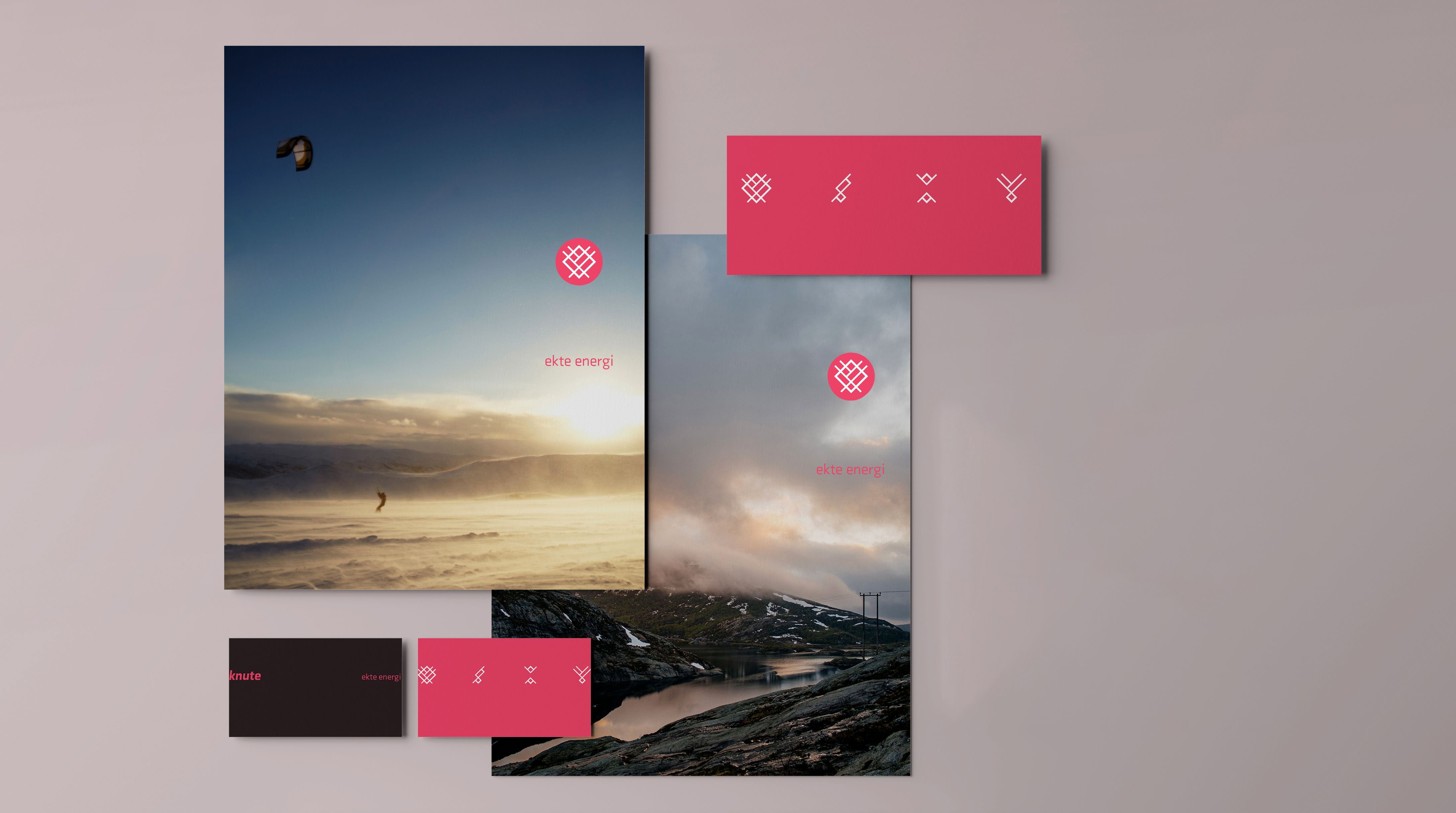
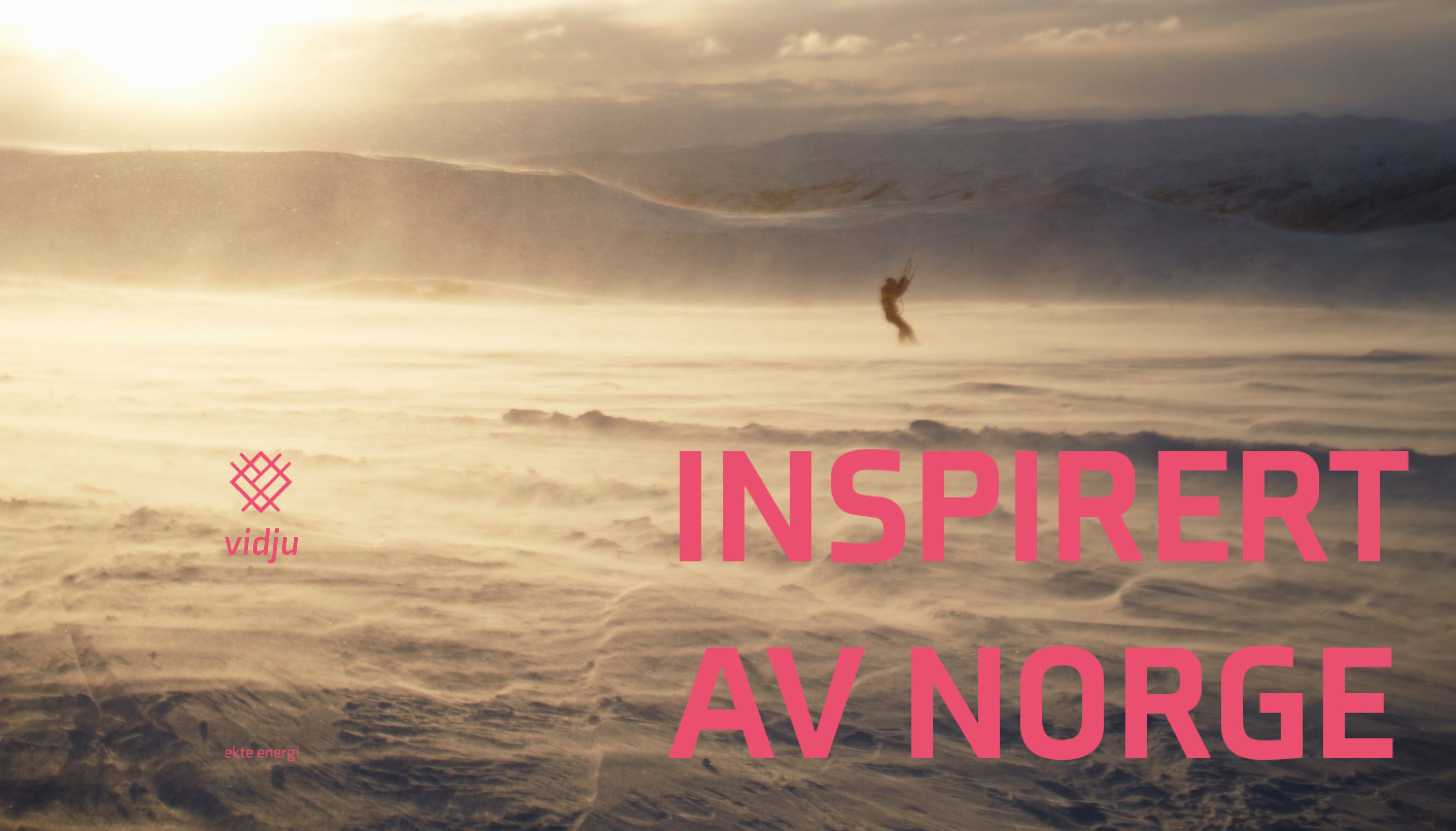
Hallingdal Kraftnett is a power company inspired by nature and of Norway. Assembled of a handful of independent companies and tasked with building and distributing energy across the major parts of central Norway, they were in need for a new identity to bring them visually together.
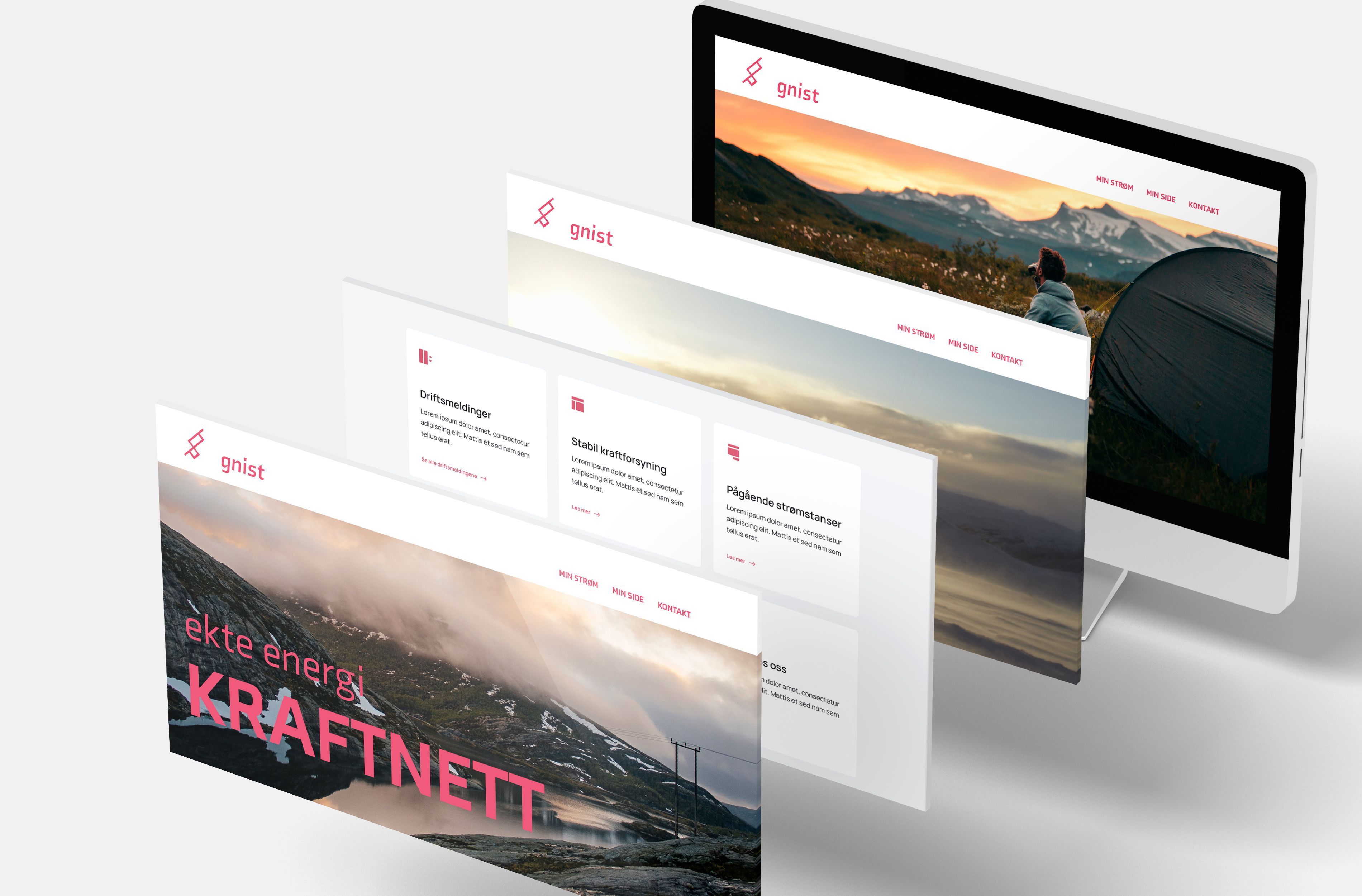
Exhibition below
Inspired by nature
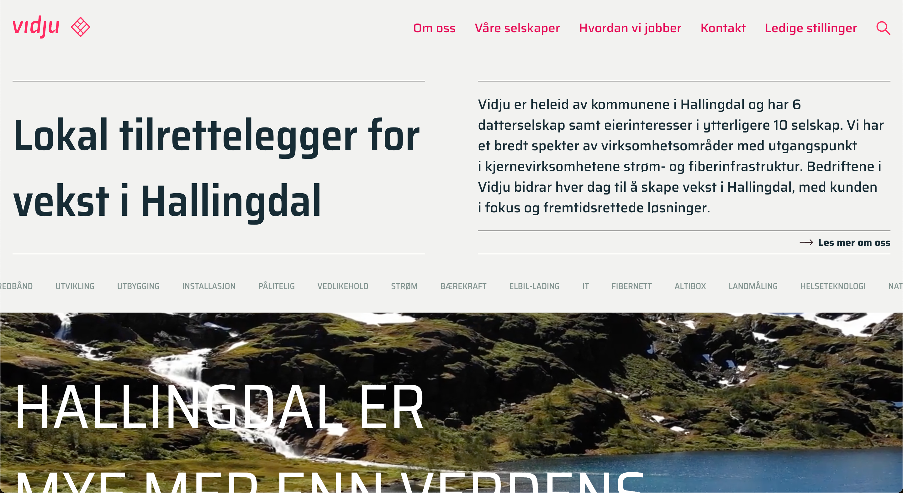
Hallingdal kraftnett is a Norwegian power company that supplies power, build and drift power networks in the Hol, Ål, Gol, Nes and Flå county, in the centre mountainous region of Norway. The agency wished to develop a new visual profile to accommodate for the expanded structure inside the company, with inclusion of additional companies.
001 - Assignment
I got to work with this assignment through the communication agency Daytwo where I had an internship as graphic designer. Together with the design team I got to develop the new visual profile for Hallingdal kraftnett. The company assigned us a brief that mapped out the details of the company itself, and from it - together with some dialogue with the client we established some challenges that we had to solve through our concept thinking and design solution. Now the main challenge was, since the company was going to integrate other companies under itself but still were going to work somewhat independently, that in addition to creating one overarching identity the client also wanted sub-identities for each company. The other challenge was that one of the companies already used a lot of money on a visual profile prior to the assembly, so finding ways to incorporate some of it into the new identity would help them go along with the new identity. The last challenge was that client still wanted the new design to have a small resemblance to the old design due to wanting to keep some of the old market value. This was a wish from the client but not necessary if a different solution could be argued for.
002 - First draft
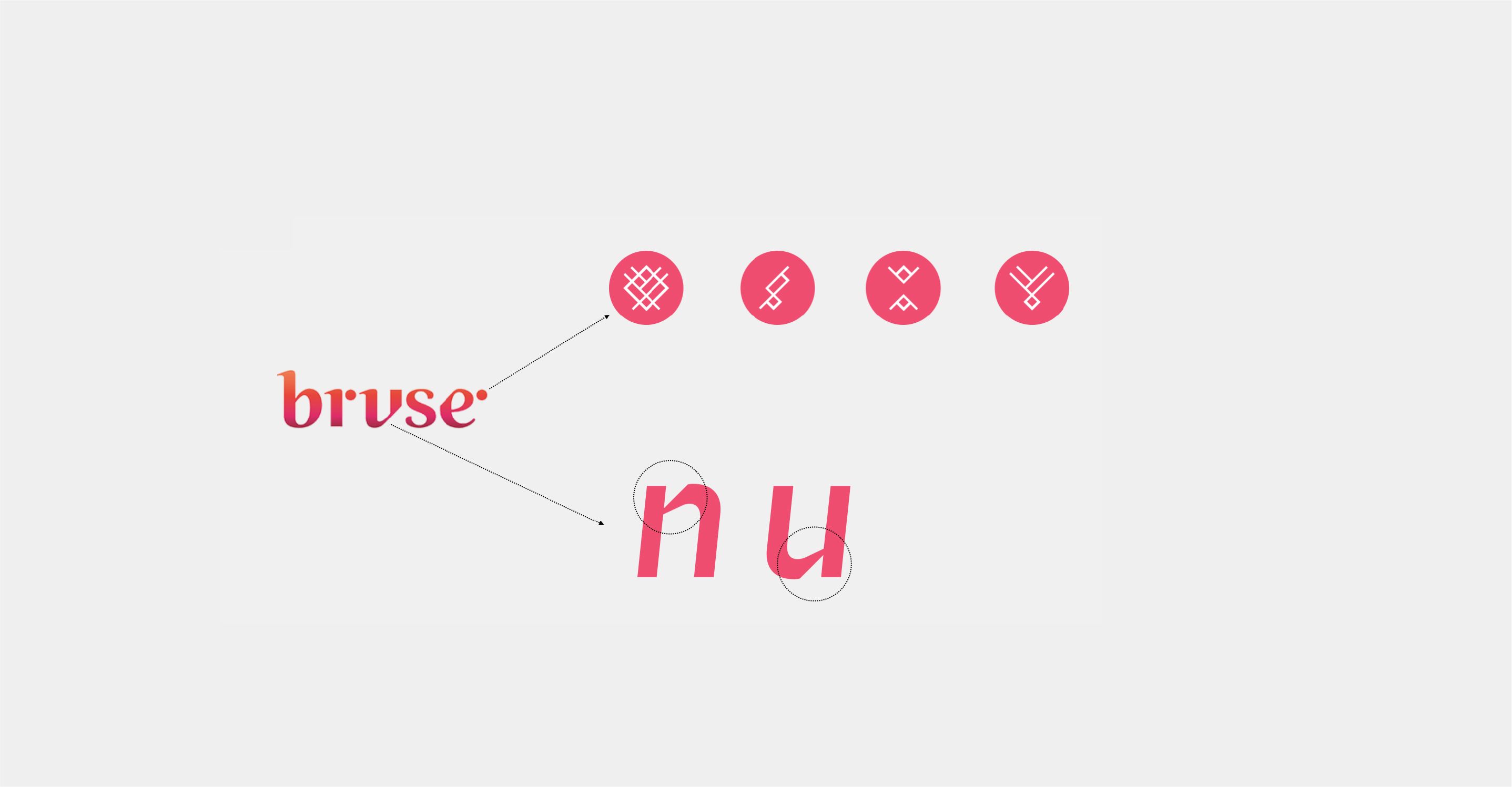
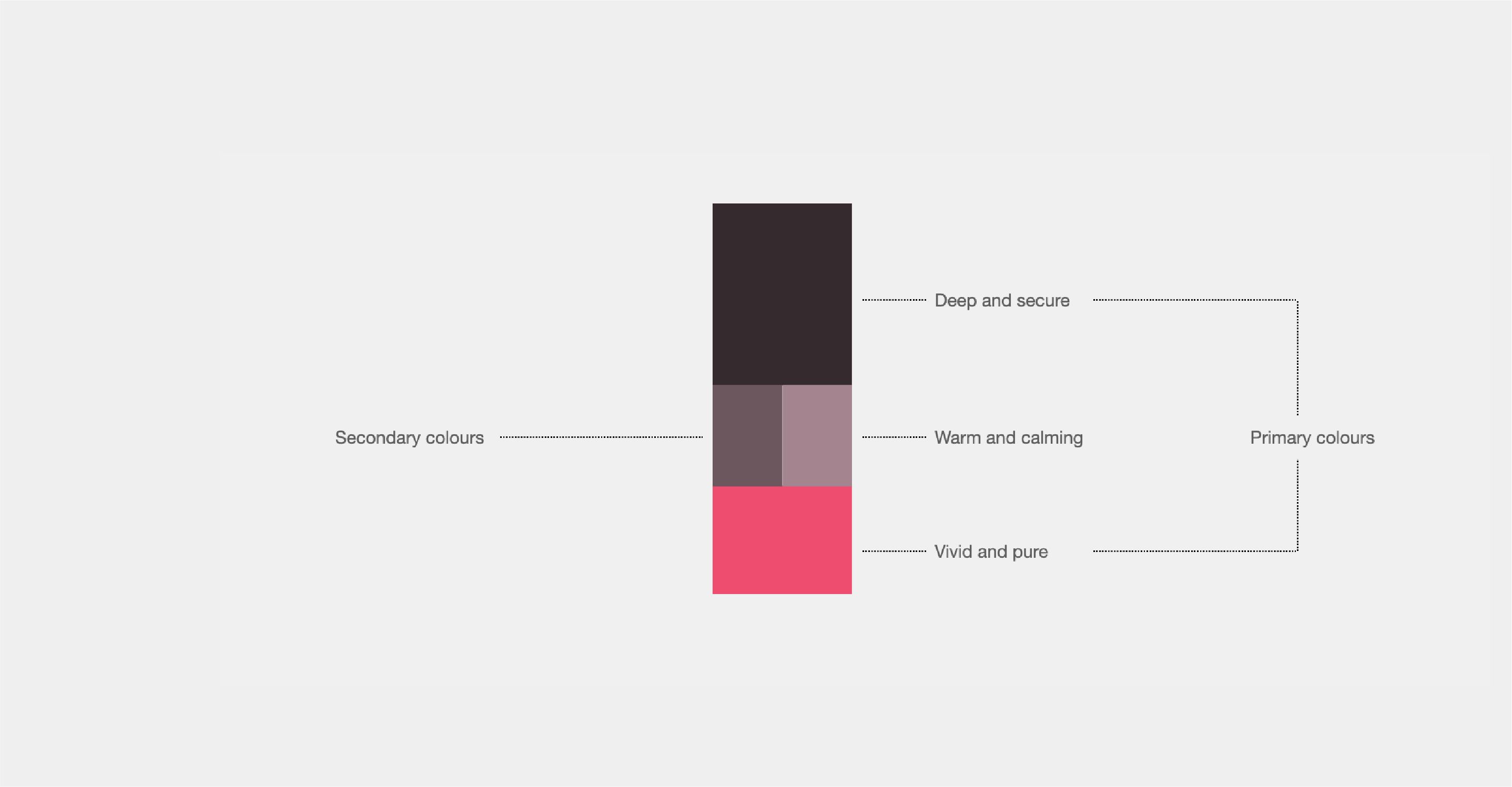
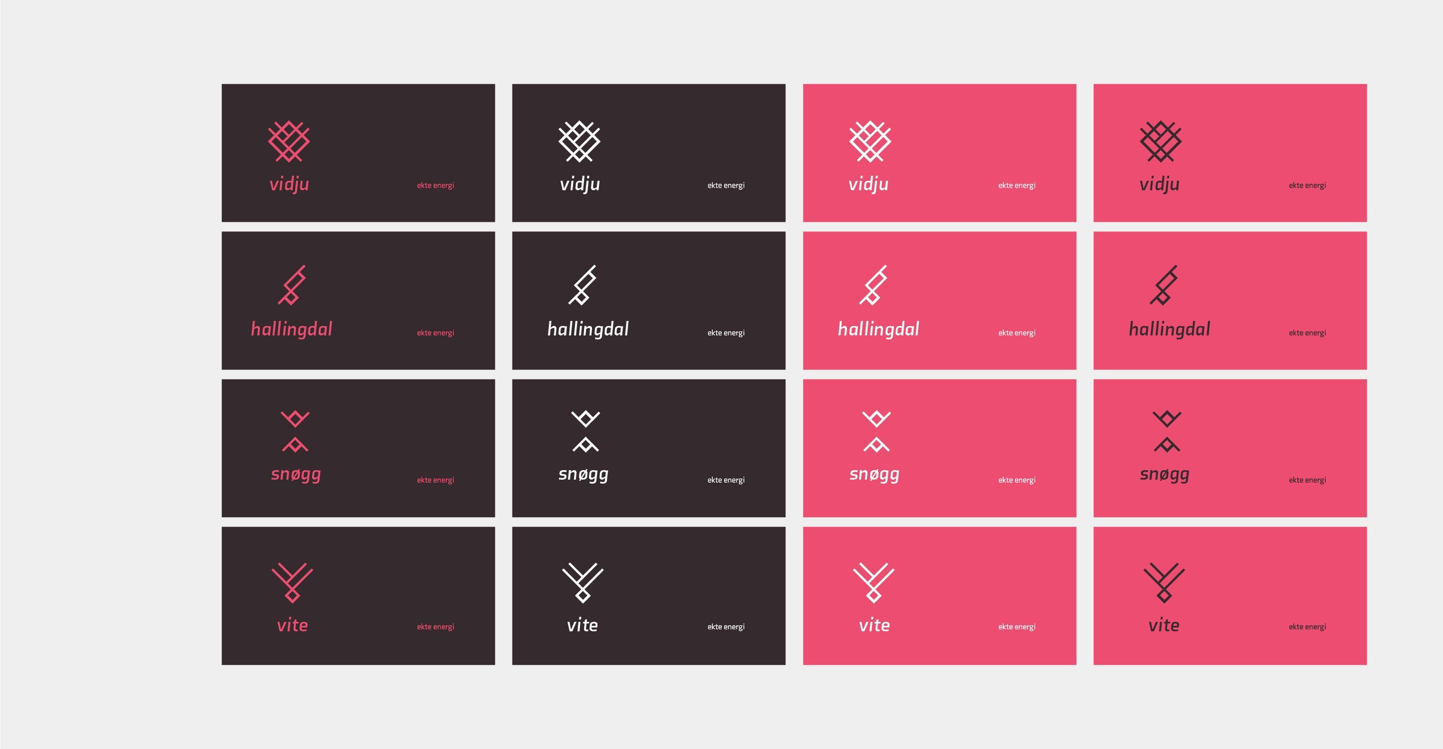
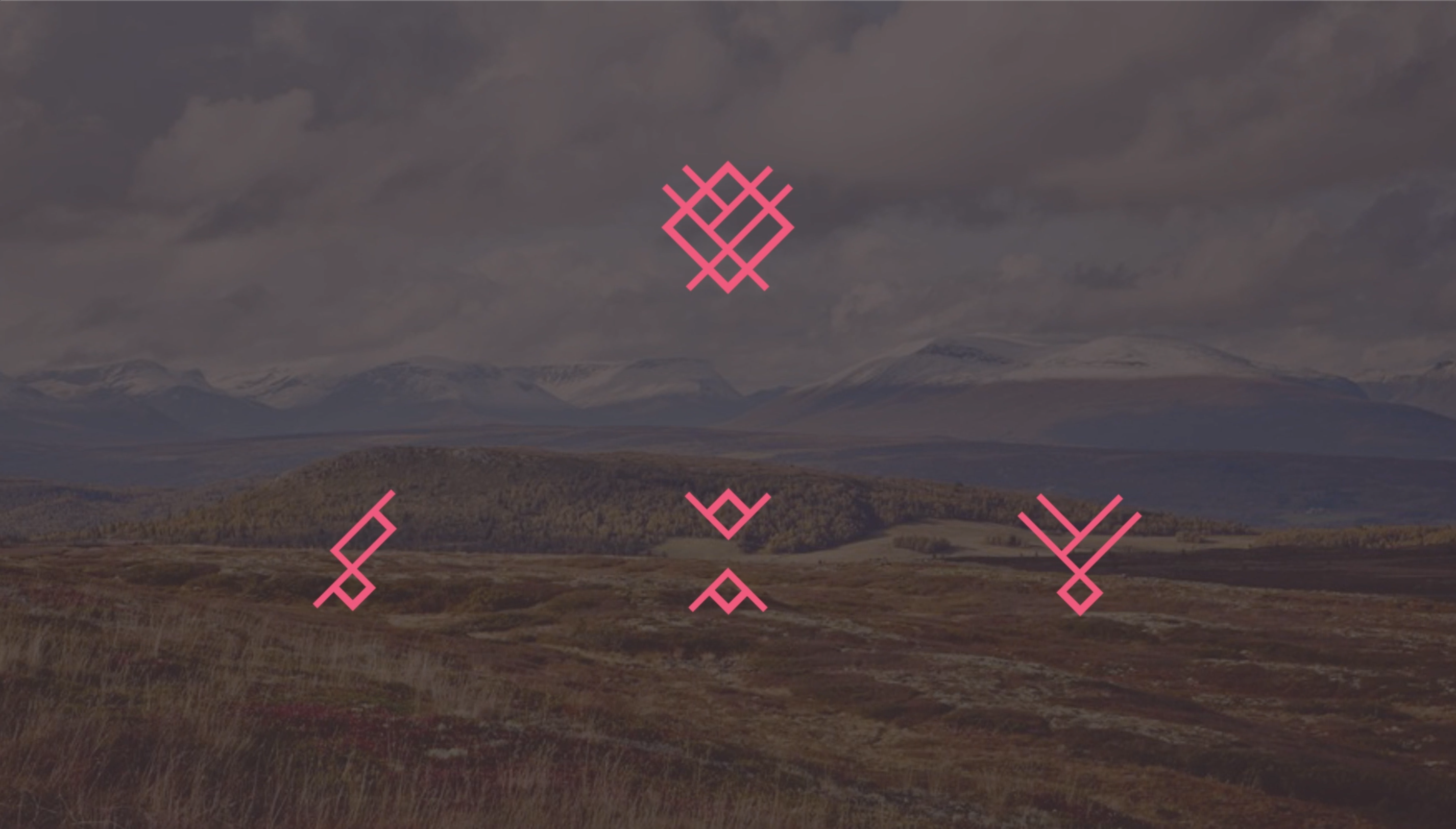
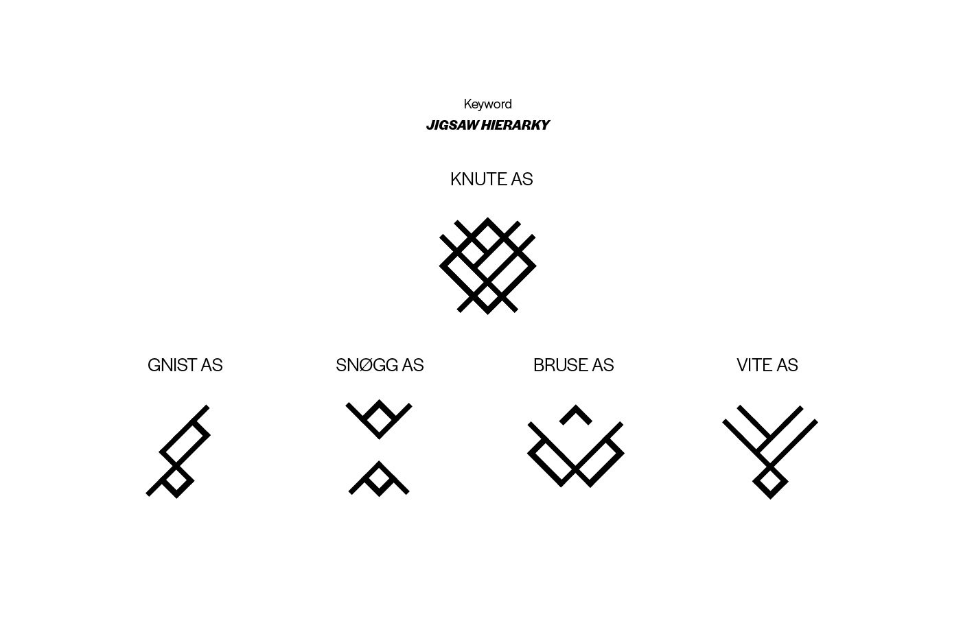
For the first draft we each went to our own to work on some options for a concept. The keywork I focussed on was “energy” and experimented on ways to illustrate through shapes and colours. For shapes I developed three drafts, each a set of icons that could be used as logos for the companies. The first draft was based on moving particles, the other was diagonal shapes that could be put together in different ways to create individual icons, and the last was a redesign of the old logo with more weight on diagonality and bolder shapes, one big icon and 4 smaller icons that was a deconstruction of the bigger. For the colour concept I developed a set of linear gradients with high contrasted and vibrating colours. After we all prepared our options, we the presented them to each other. Our senior designer then made a presentation we then showed in a clientmeeting and my logo rebrand and gradient colours became popular. We ended up developing them further, the logos stayed as they were, but the colours needed to be toned down due to a bit too much complexity. The client especially liked the purple gradient and the senior designer ended up making a colour palette based on it.
004 - Second draft
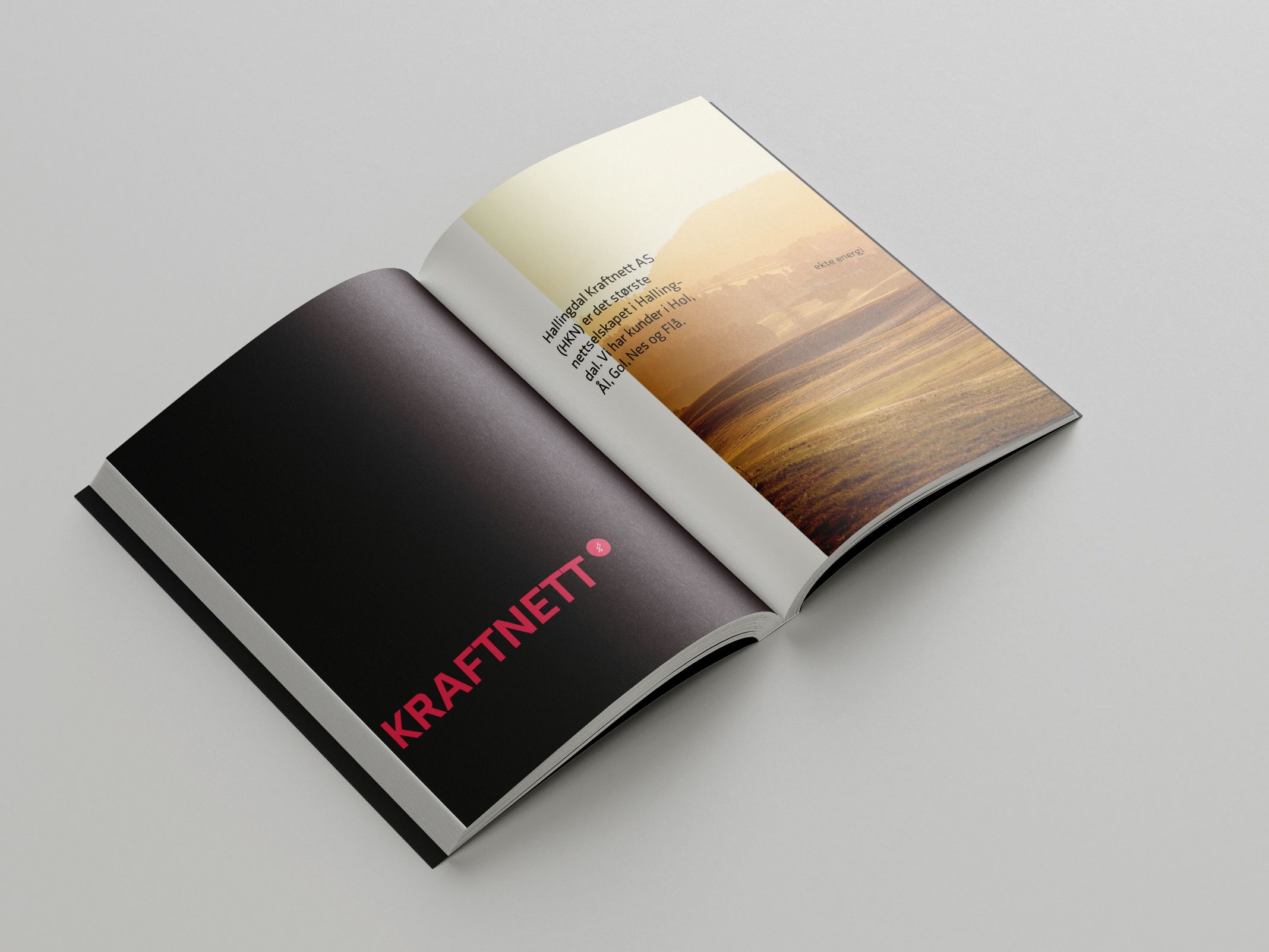
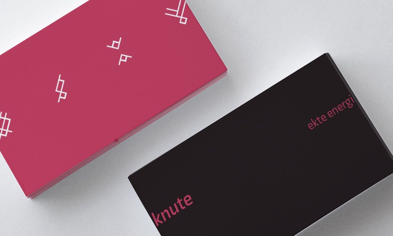
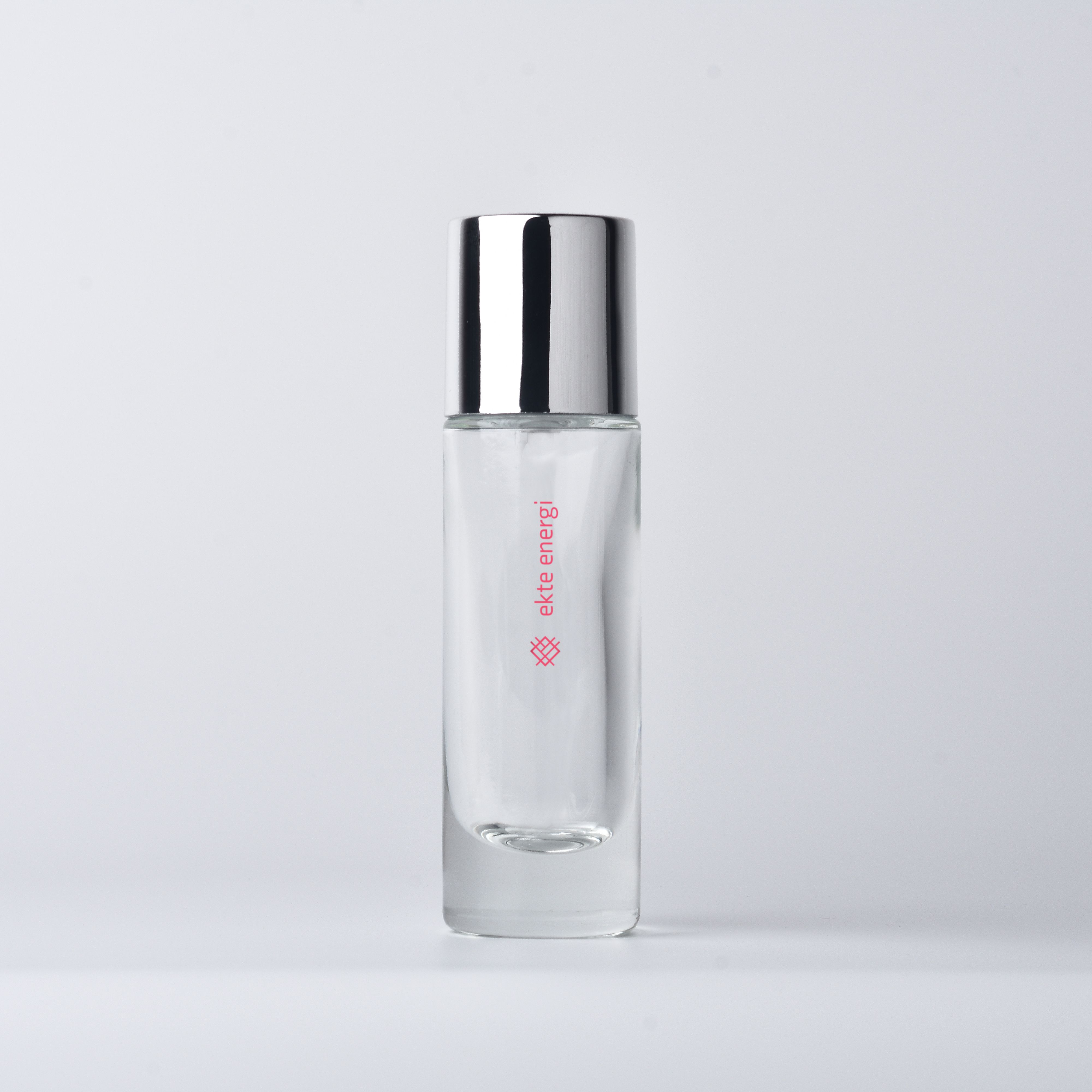
The last we needed to complete the identity foundation was typography. The design team then again went our own to research for some options. I selected two fonts I made some visual tests out of, and then presented them to the team for feedback. We ended up going for one of my options, “Axia”, which is a sans serif typeface with some pronounced angular details in the joints. We remarked that it had some similarities in the angular elements to the logo from the company with the new profile, and the senior designer then came up with the idea to transfer the same angle value from the logo to the typeface, bridging the gap between the two. I adjusted it so and paired the company names with their respective icon to create the finalized set of logos. We’ve completed the design foundation and we could then start to illustrate content to the second meeting. Senior designer prepared a presentation once again and we presented to the client with very positive feedback. They were sold on the visual concept and wanted to present the result in the next board meeting, we were finally tasked with preparing the pitch deck for said meeting.
005 - Animation
My contribution to the pitch deck was to create an animation to illustrate the conversion from the old brand to the new. I started with some sketching and prepared a storyboard I presented the design team. The story act was simply to present the old visual identity, colour and all, pick out the main logo, disassembling it and reassembling it into the new logo. And when the logo snaps back together with a bounce so does the colour scheme, and out from the main logo pops the sub-logo out, displaying the whole set. I got thumbs up on the sketch and started the production. I was able to finish animating it right before the meeting, it came out nicely despite the short time had on animating it. The pitch deck was assembled and sent to the client.


