Narvik Green Ammonia
2024
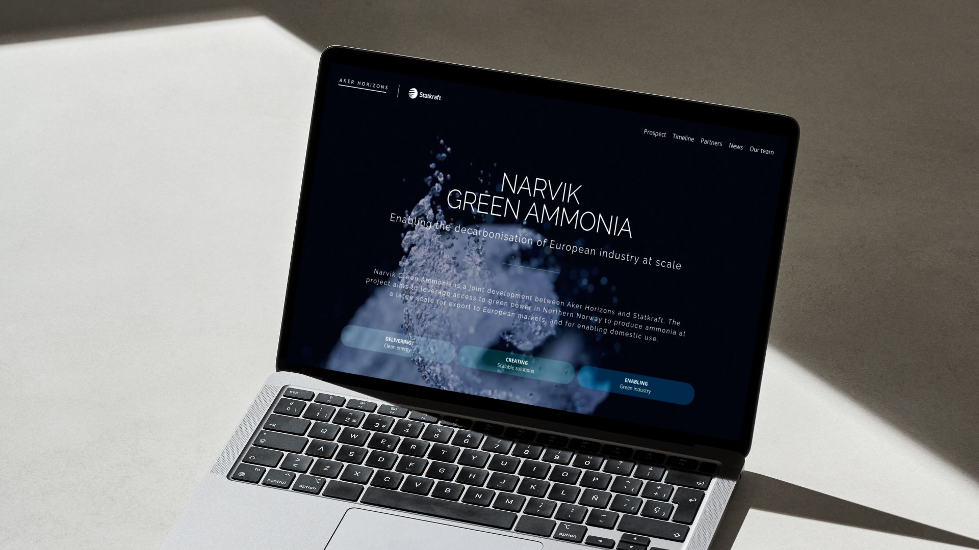
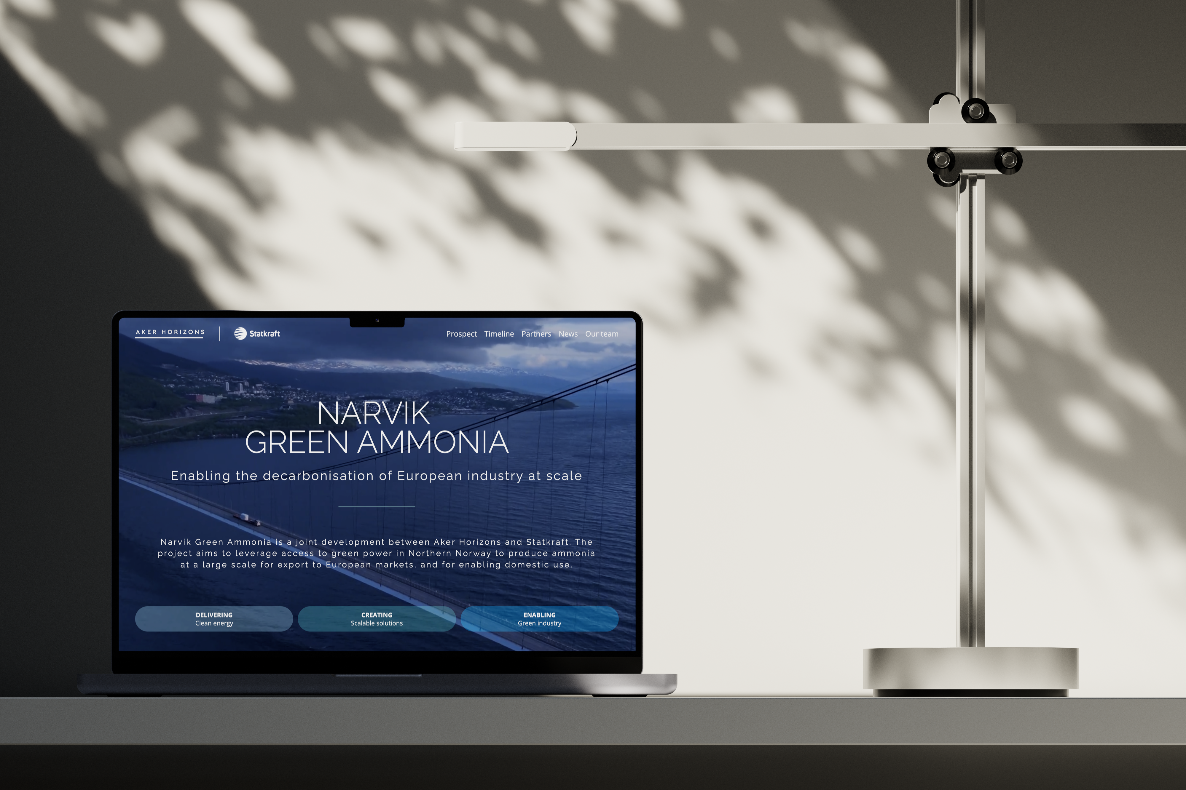
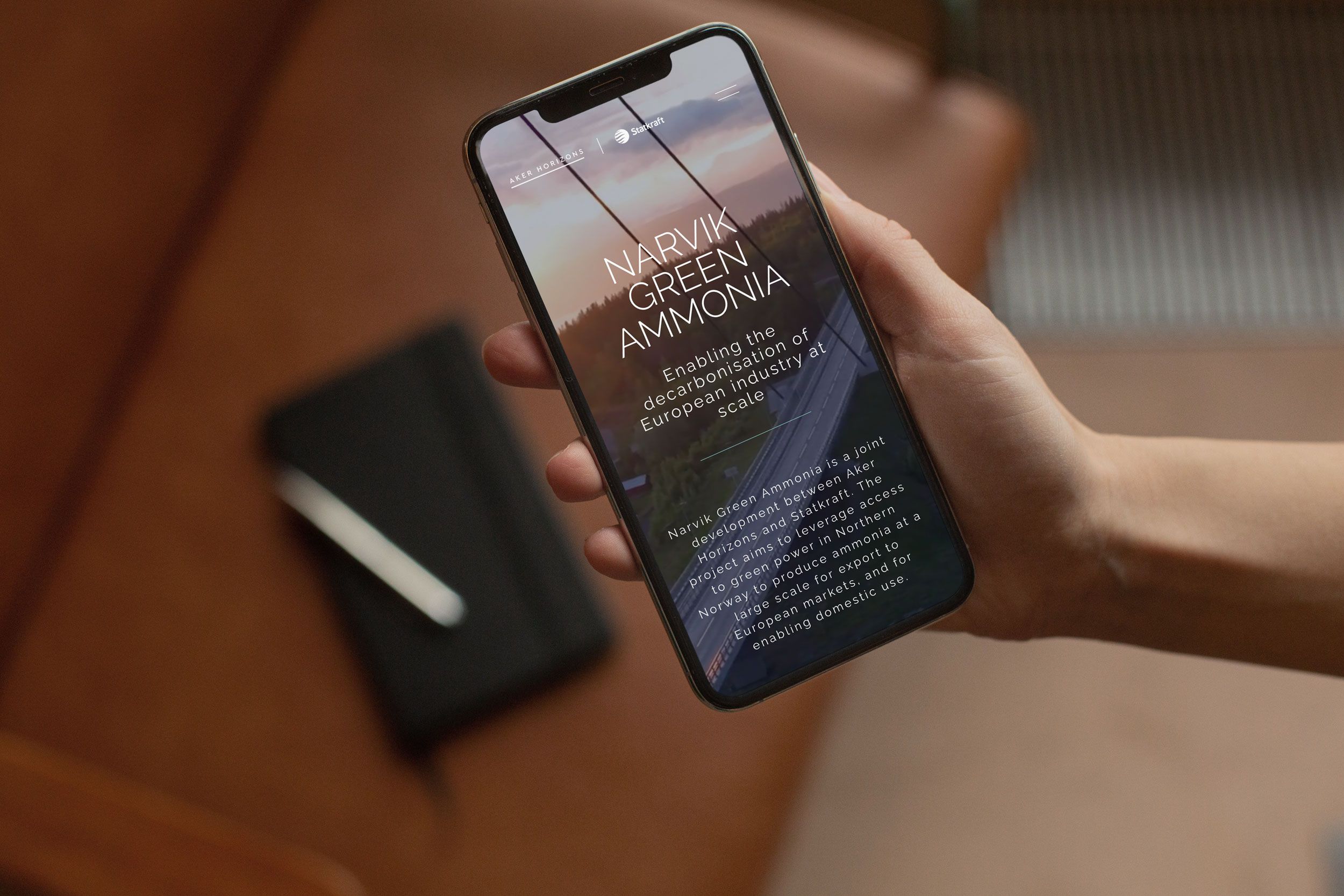
Narvik Green Ammonia is a joint development between Aker Horizons and Statkraft. The project aims to leverage access to green power in Northern Norway to produce ammonia at a large scale for export to European markets, and for enabling domestic use. In collaboration with the Supernordic Studio team I've been able to take part in developing NGA's new website.
Project assets:

Contributors:
Supernordic Design Studio
João Rocha
Customers:
Aker Horizons
Statkraft
Exhibition below
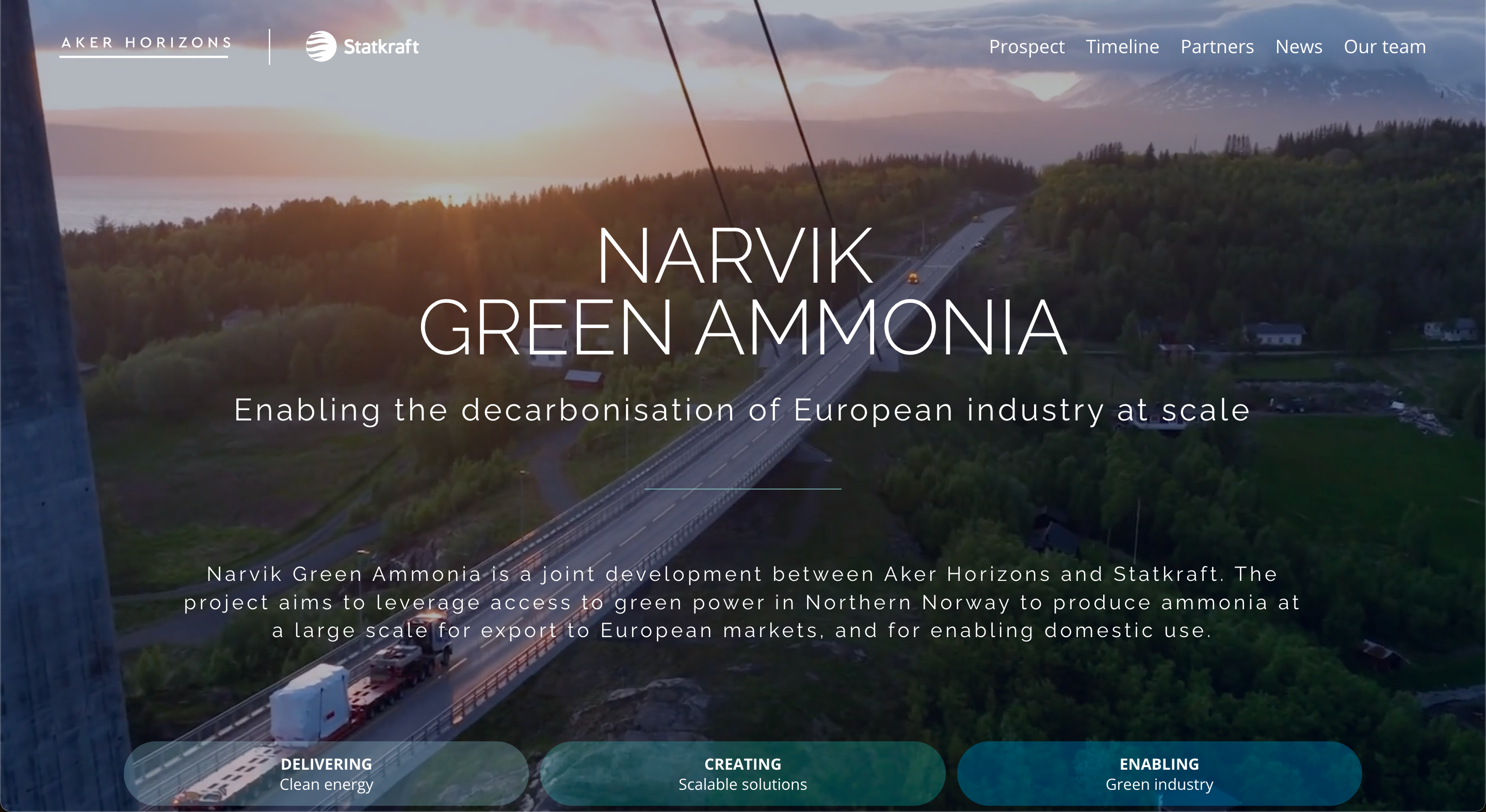
Decarbonise European industry at scale
Narvik Green Ammonia is a joint development between Aker Horizons and Statkraft. The project aims to leverage access to green power in Northern Norway to produce ammonia at a large scale for export to European markets and for enabling domestic use. Working closely with the Supernordic Studio team, I played a key role in developing NGA's new brand and website. By collaborating effectively and providing clear instructions, we ensured that each element of the brand and website was meticulously crafted to align with NGA's vision and goals.
001 - Branding and UX design
The project began when our contact at Aker Horizons reached out to us to share their vision for Narvik Green Ammonia. They needed an output to present their new company concept, leading to the commission of a branded informational website and illustrations. They provided a list of the content they wanted on the website, which I used to create a base wireframe. While I was developing the wireframe, the team drafted the company brand, including the font, color, and image style. I then incorporated these branding elements into the wireframe to create a sample of the look and feel for presentation to the customer. It was crucial to convey that this company was a coalition between two major entities. Consequently, the logo was designed as a combination of the Aker Horizons and Statkraft logos.
002 - Website development
After presenting the prototype and receiving approval, I could begin developing the website. Since the website needed to be managed by our customer, we chose Squarespace for its intuitive CMS. The website was built like any other Squarespace site, where I recreated all the sections from the prototype and utilized Squarespace's features such as blog posts, summary blocks, and general site builder tools. However, there were two sections that required custom development to meet the customer's needs. First, I coded the timeline from scratch, a simple component that animates when it comes into view. Second, I made minor styling adjustments to the image carousel on the landing page to include text elements connected to each image.
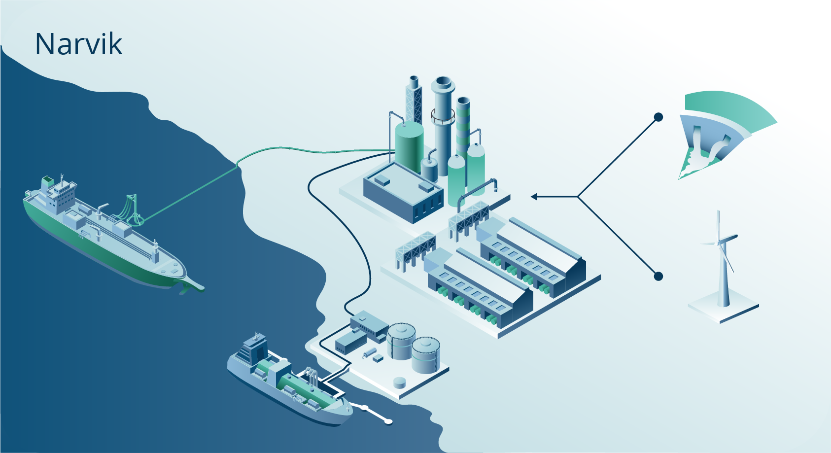
003 - Illustration & Animation
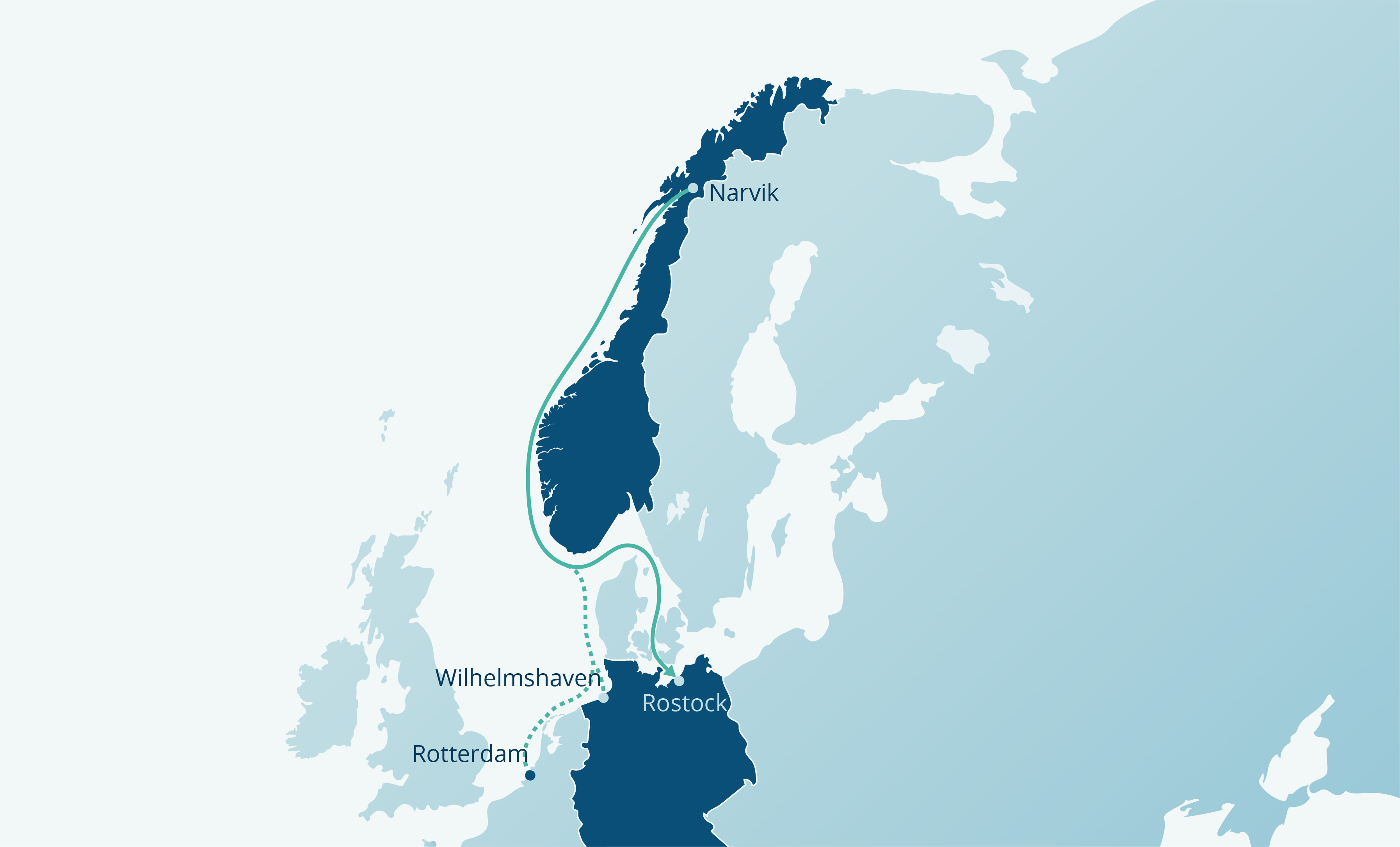
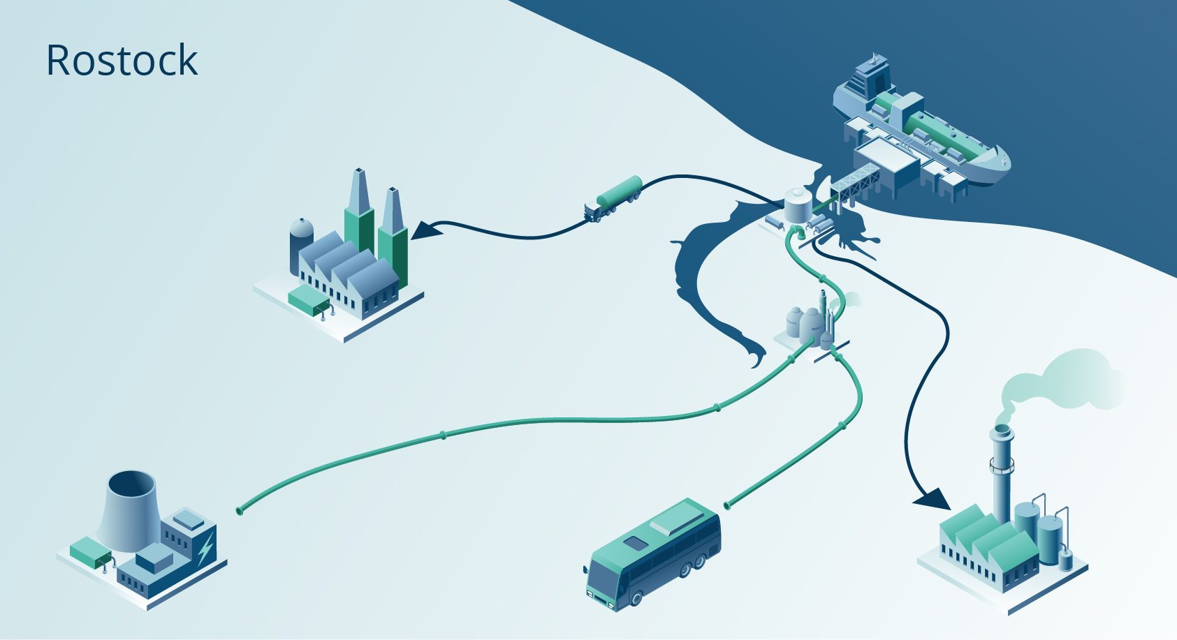
While the website was under development, we needed to create explanatory elements for the webpage. First, we required illustrations to depict the process of energy conversion and the shipping of ammonia and hydrogen across Northern Europe. Our customer provided a brief detailing the process and the key points they wanted to highlight. I communicated this to our freelance illustrator, João Rocha, and commissioned three illustrations. We then worked closely with the customer to ensure the illustrations accurately represented the process and conveyed the intended message. Secondly, the website needed an engaging element for the hero section on the landing page, so we decided to create a video backdrop. We obtained footage from key operational locations, curated some stock footage, and edited a short looping clip for the front page. Once these elements were completed, I implemented them and polished the webpage until it was ready for launch.